


6
Live! by Loews Branding and Identity

0
Goodwin Brand Refresh

4
Goodwin Social Media Template Library

8
Flavor By Loews Hotels Branding and Identity

7
Loews Loves Families Brand Development

4
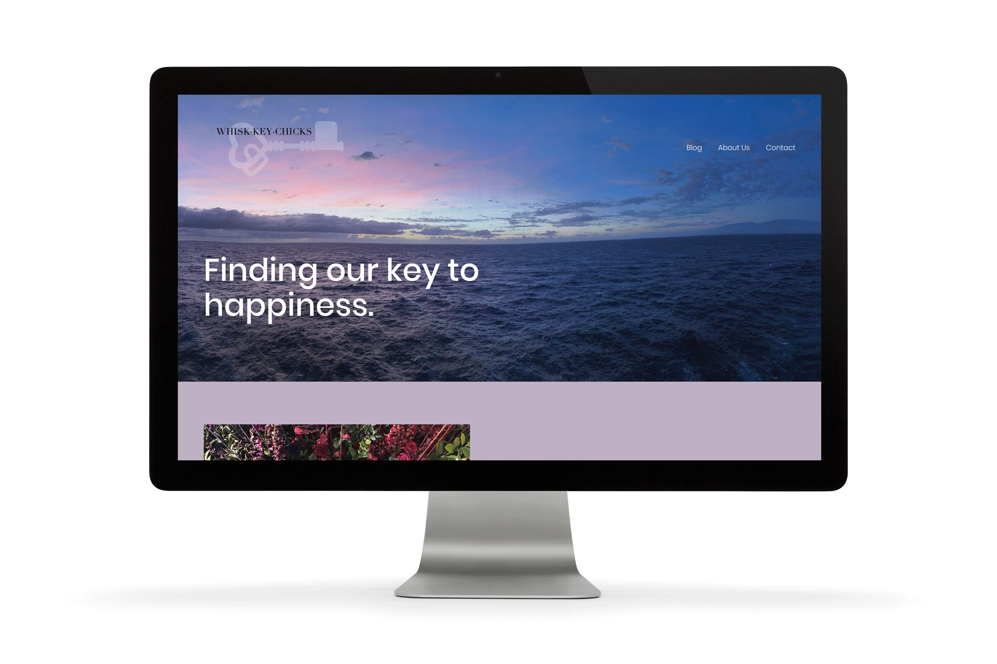
Whisk.Key.Chicks Branding and Creative Direction

2
Loews Hotels Catering Menu Templates

5
Loews Santa Monica Beach Hotel Waterfront Wonderland

9
Loews Lakeside Spa Brand Identity Redesign

4
Custom Wedding Suite

7
Loews Hotels In-Room Dining Collateral

4
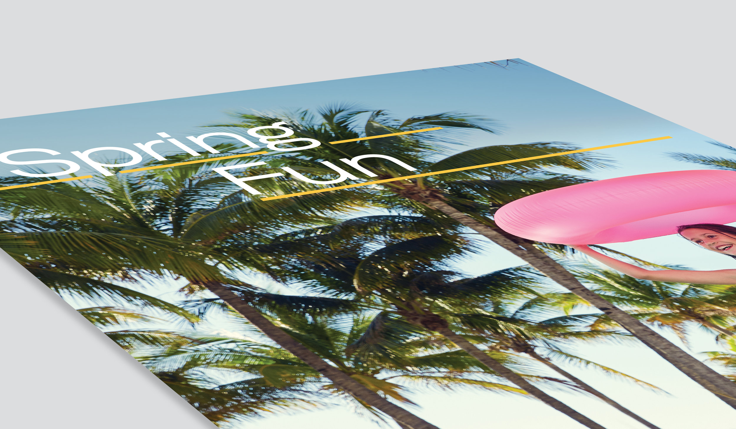
Loews Miami Beach Hotel Spring Fun Campaign

3
Loews Hotels Celebration Cards

0
Museum of Arts & Design

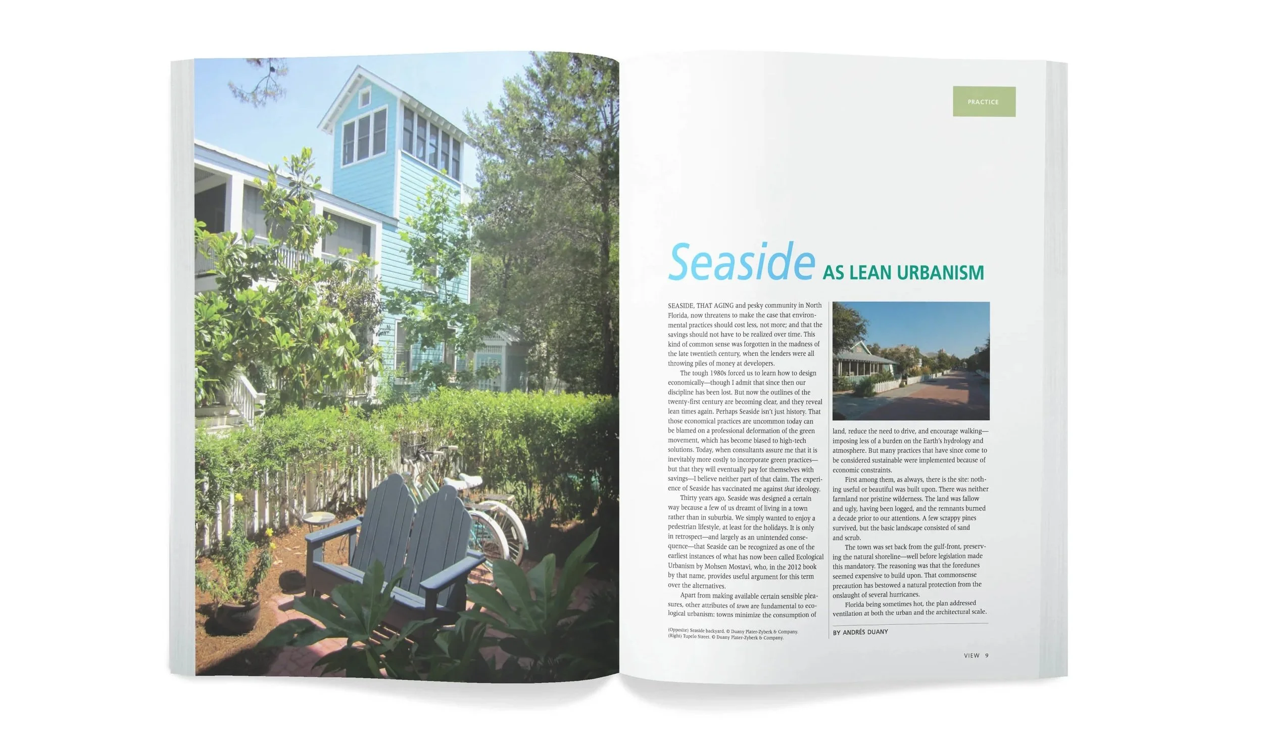
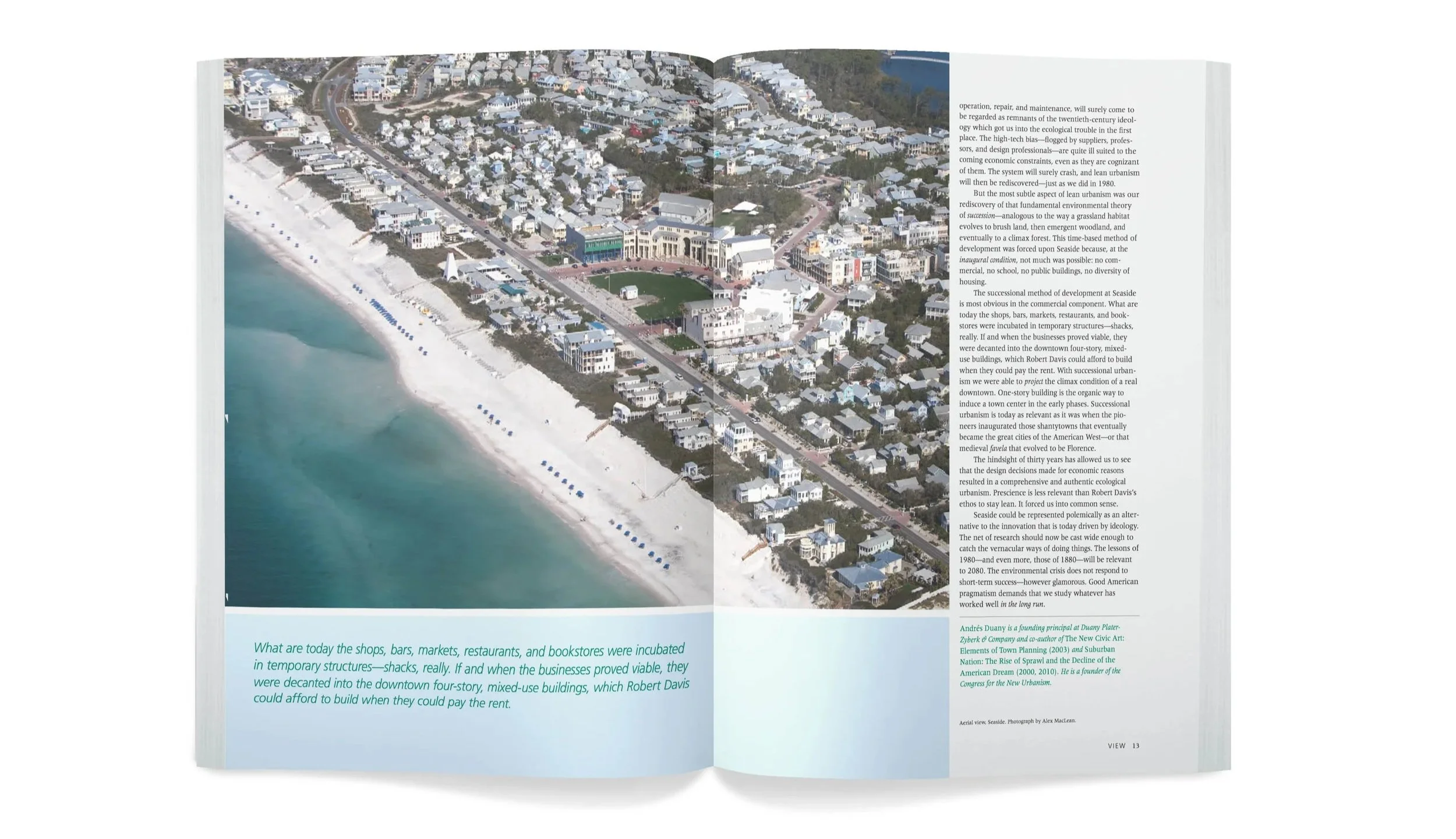
13
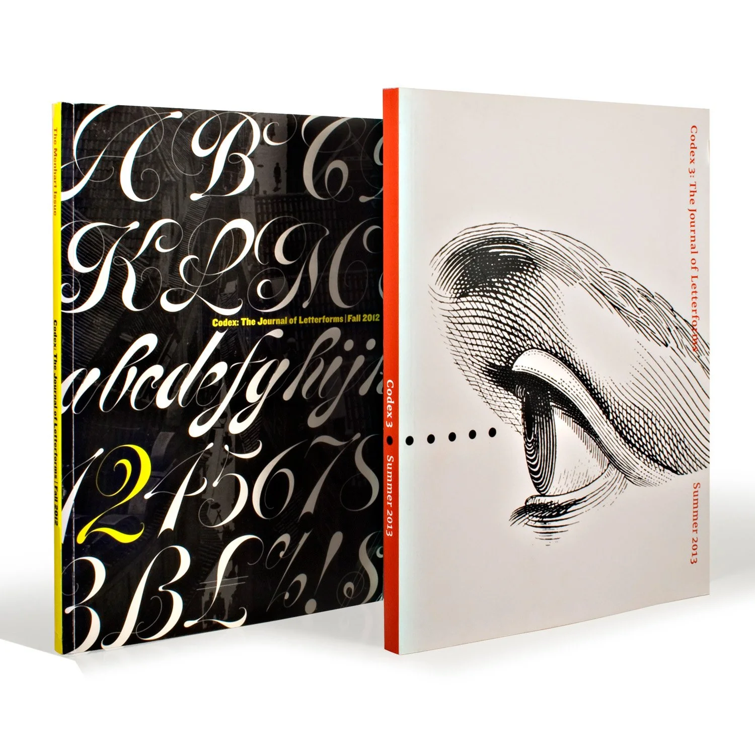
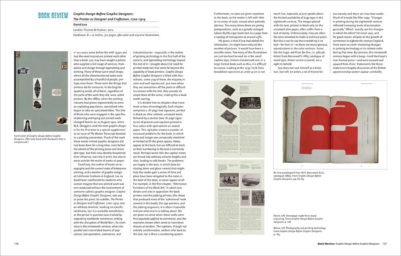
Codex Florio Design

5
Gardening by the Book Florio Design

5
826 Schermerhorn Columbia University

5
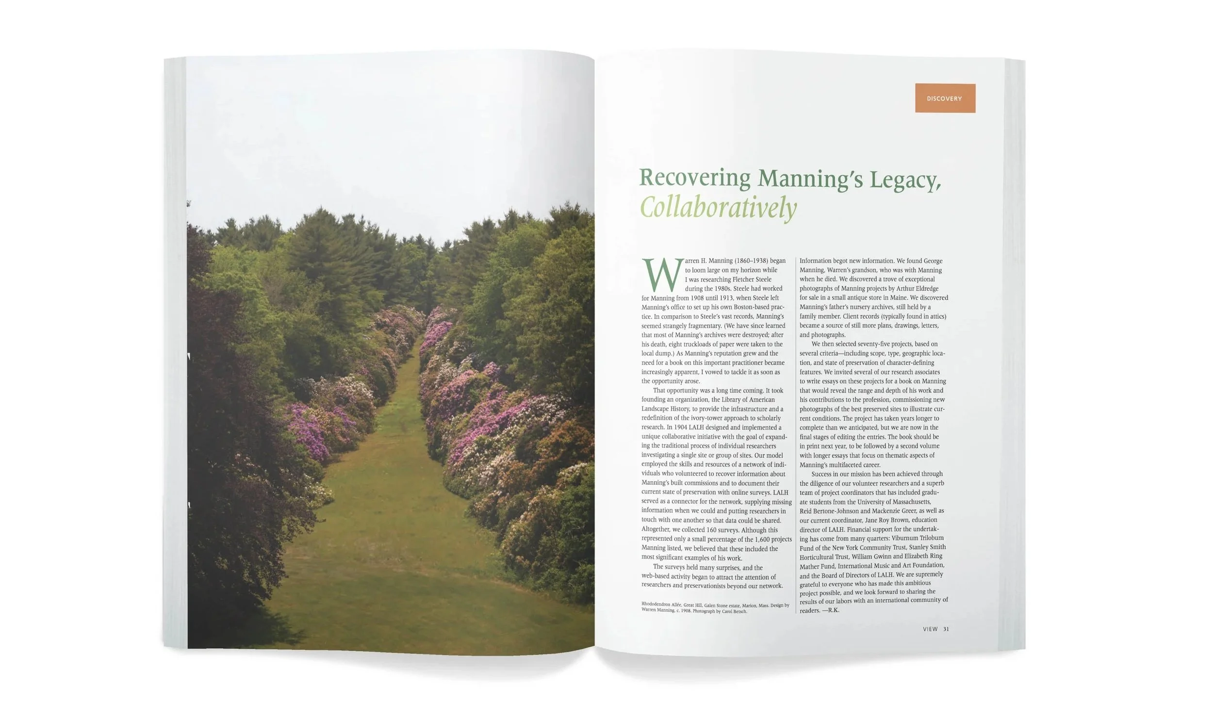
LALH